This project was for the branding development of a new product being launched. These are small envelopes of CBD Powder. There are 5 items in this category. I delivered Sub Branding to show completely different thinking in multiple directions and two on On Branding for their already developed products to also include the boxes.
Development also included giving the product a name and logo.
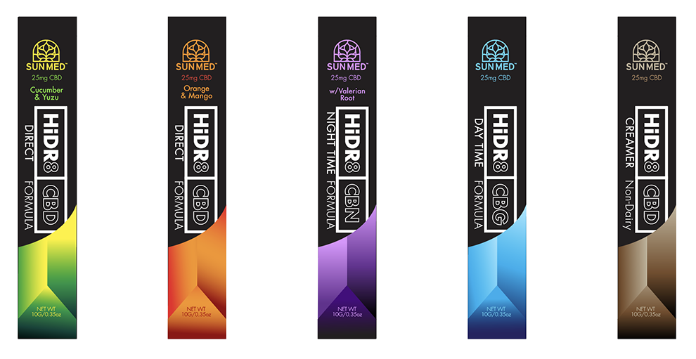
HiDR8 (Hydrate): This is a high tech version to represent New and Exciting…as well as new delivery system.
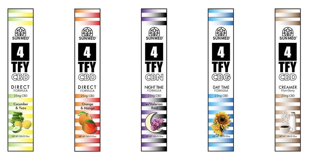
4TFY (Fortify): Fun and vibrant showing fusion of flavors and continued theme
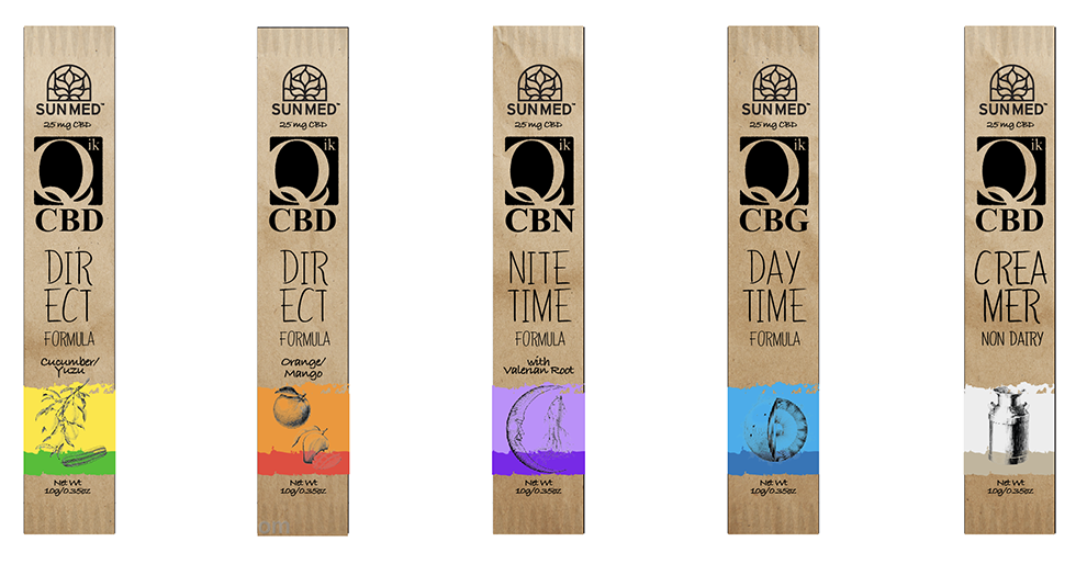
Qik (Kick): All Natural version to look and give the appeal of farmers market. It is not brown paper, but printed on the packaging.
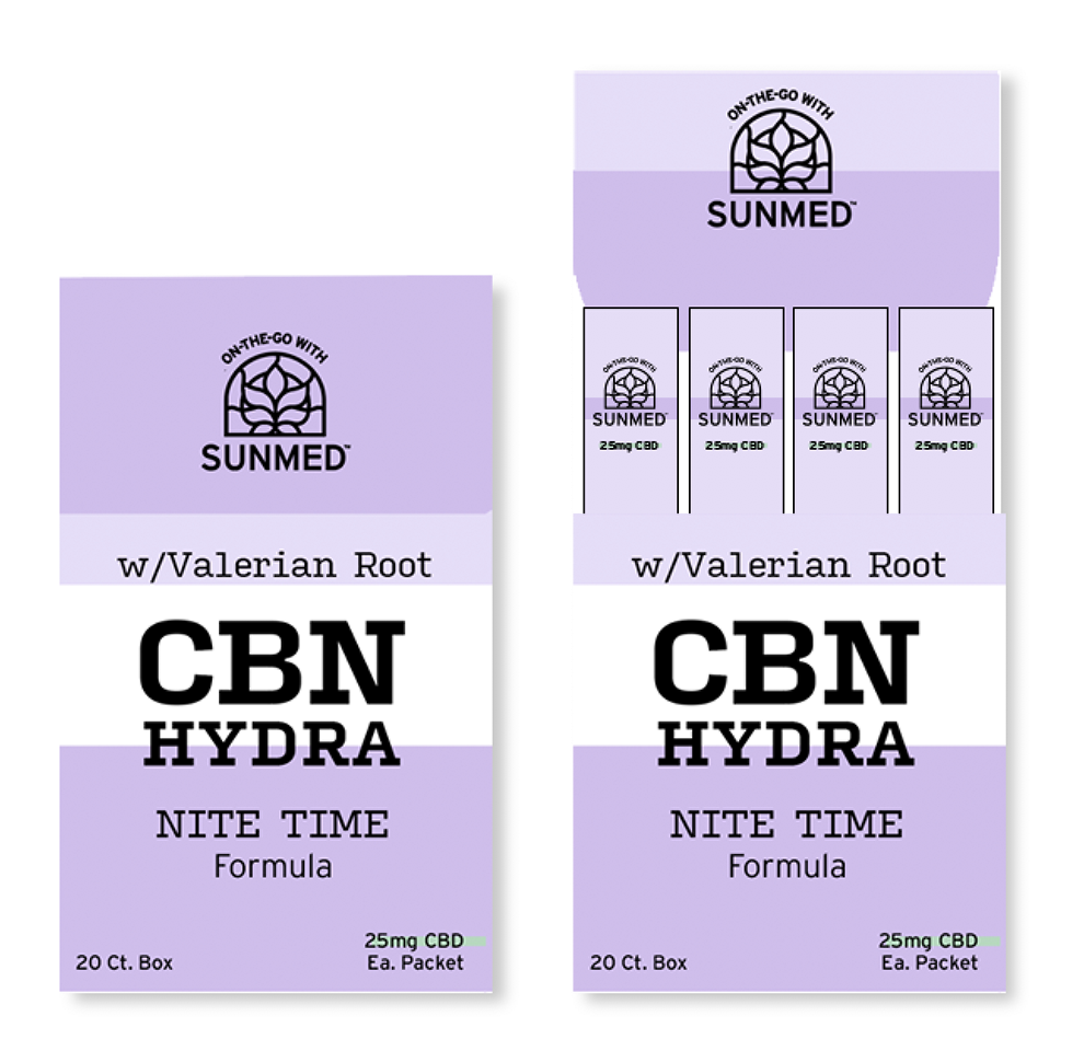
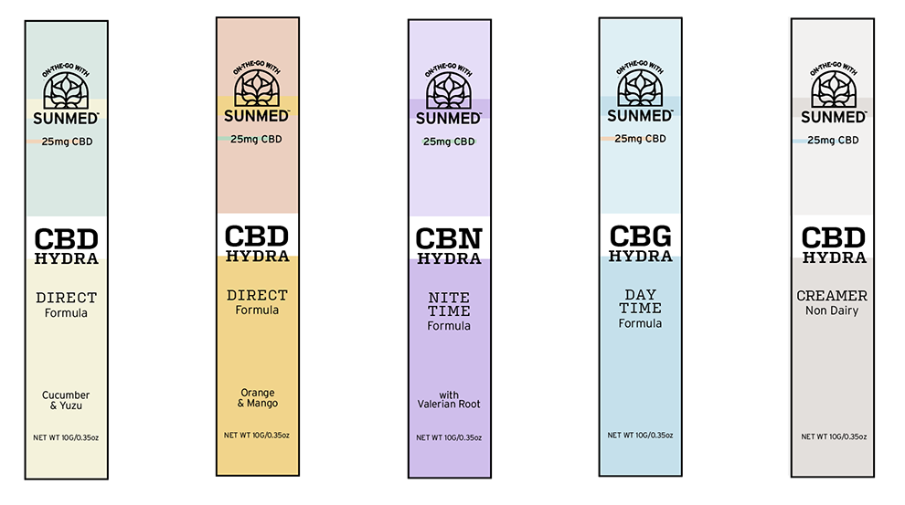
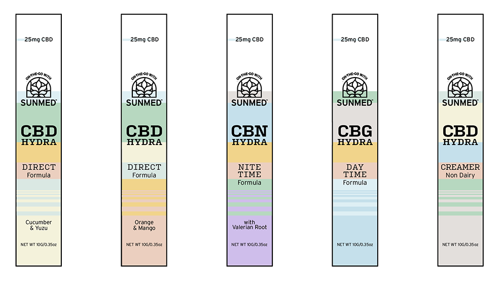
Hydra (Hydrate): This is a simpler direction, but is kept steady on the present color campaign of the brand “SUNMED” … While simple, I found it easier to identify which is which in the event you have multiple packs.
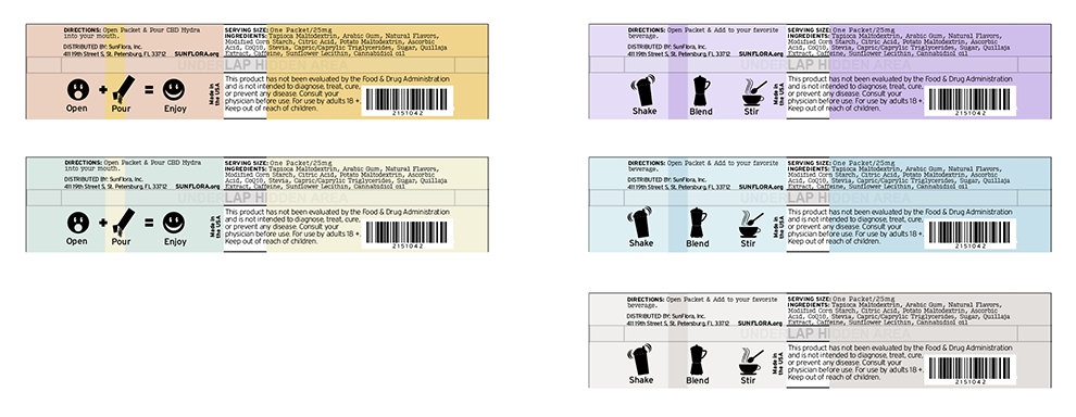
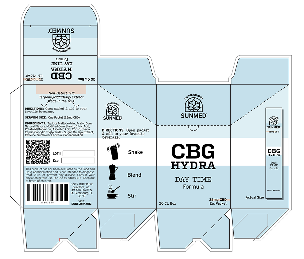
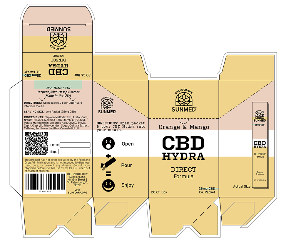
Alternative on brand color scheme.
Box Design for First Concept.
